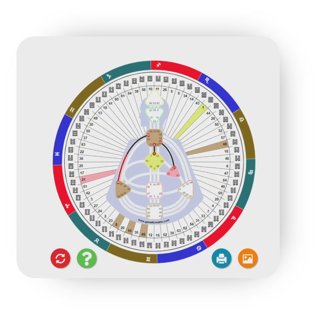
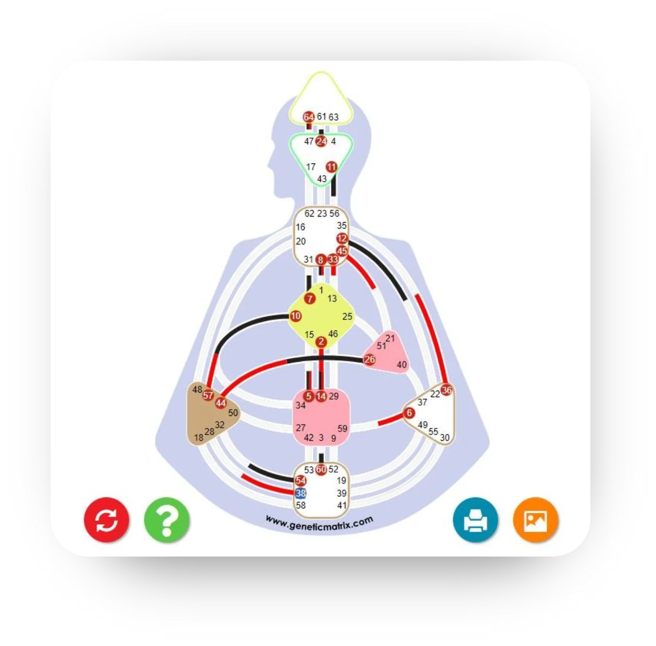
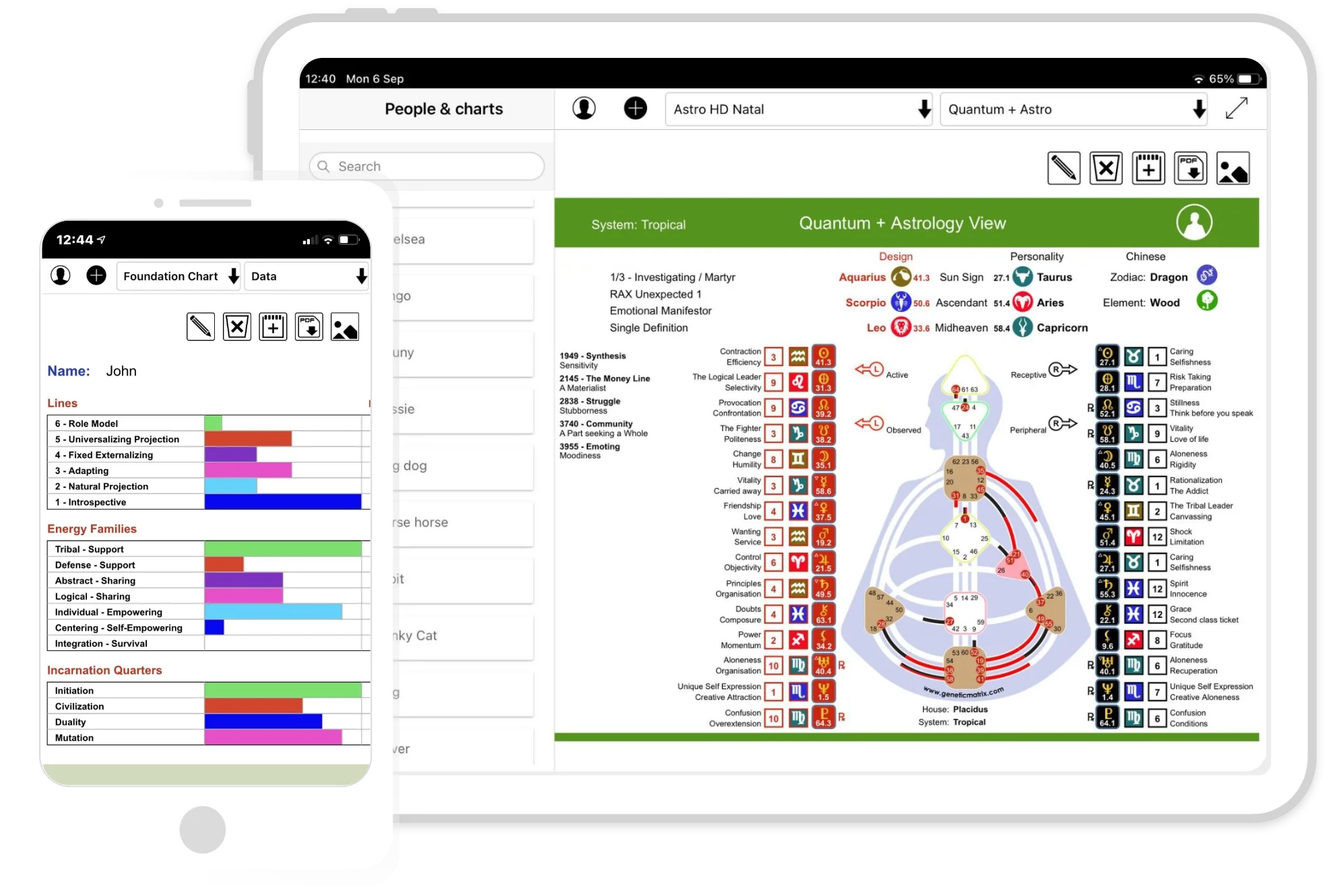
@media screen and (max-width: 1920px) { .chartmodalcontent .Createchart{ white-space: normal; } .subscription-para { height: 56px; } .settings-info, .setting-names, .anonymise-data, .member-status, .select-name, .password-name{ white-space: normal; } /*.log-out{*/ /* left: 210px;*/ /*}*/ .Createchart{ height: auto; } .membertitle h5 { height: 60px; } .c-button { width: fit-content !important; } .checkbox-text label{ margin-left: 0px !important; } .animal_windows-heading{ white-space: nowrap; } .familych-input input{ width: 185px; font-size: 14px; margin-left: 17px; } } @media screen and (max-width: 1756px){ .service-content2{ height: 340px !important; } .service-content1 { height: 670px !important; } } @media screen and (max-width: 1774px) { .subscription-para { height: 62px; } .settings-info, .setting-names, .anonymise-data, .member-status, .select-name, .password-name{ font: normal normal normal 19px/18px Bilo; } } @media screen and (max-width: 1770px) { .subscription-para { height: 43px; } } @media screen and (max-width: 1730px) { .settings-info, .setting-names, .anonymise-data, .member-status, .select-name, .password-name{ font: normal normal normal 19px/18px Bilo !important; } .subscription-para{ height: 42px !important; } } @media screen and (max-width: 1717px) { .settings-info, .setting-names, .anonymise-data, .member-status, .select-name, .password-name { font: normal normal normal 18px/18px Bilo !important; } } @media screen and (max-width: 1663px) { .settings-info, .setting-names, .anonymise-data, .member-status, .select-name, .password-name { font: normal normal normal 16px/18px Bilo !important; } } @media screen and (max-width: 1586px) { .settings-info, .setting-names, .anonymise-data, .member-status, .select-name, .password-name{ font: normal normal normal 16px/18px Bilo !important; } } @media screen and (max-width: 1574px) { .service-content1 { height: 550px !important; } } @media screen and (max-width: 1557px) { .settings-info, .setting-names, .anonymise-data, .member-status, .select-name, .password-name{ font: normal normal normal 15px/18px Bilo !important; } } @media screen and (max-width: 1543px) { .subscription-para{ height: 46px !important; } .chart-modal{ font-size: 18px !important; } /*#sidebar-wrapper{*/ /* width: 350px;*/ /*}*/ } @media screen and (max-width: 1539px) { .chart-modal{ font-size: 18px !important; } .signin, .registerbtn { font: normal normal bold 18px/29px Bilo !important; } } @media screen and (max-width: 1538px) { .subscription-para{ height: 50px !important; } } @media screen and (max-width: 1536px) { .settings-info, .setting-names, .anonymise-data, .member-status, .select-name, .password-name{ font: normal normal normal 15px/18px Bilo !important; } .subscription-para{ height: 42px !important; } } @media screen and (max-width: 1500px) { .settings-info, .setting-names, .anonymise-data, .member-status, .select-name, .password-name{ font: normal normal normal 14px/18px Bilo !important; } } @media screen and (max-width: 1496px) { .subscription-para{ height: 42px !important; } .settings-info{ padding: 30px 40px !important; } } @media screen and (max-width: 1470px) { .settings-info, .setting-names, .anonymise-data, .member-status, .select-name, .password-name{ font: normal normal normal 13px/18px Bilo !important; } .subscription-para { height: 45px !important; } .mobilesupportbg { padding-bottom: 50px; } .up-subscription, .cancel-card, .up-card{ font: normal normal bold 15px/18px Bilo !important; } } @media screen and (max-width: 1456px) { .service-content1 { height: 600px !important; } } @media screen and (max-width: 1443px) { .settings-info, .setting-names, .anonymise-data, .member-status, .select-name, .password-name{ font: normal normal normal 14px/18px Bilo !important; } .subscription-para { height: 41px !important; } /*#sidebar-wrapper {*/ /* width: 320px !important;*/ /*}*/ /*.cancel-btn{*/ /* left: 85px !important;*/ /*}*/ /*.log-out {*/ /* left: 160px;*/ /*}*/ .subscription-para { height: 43px !important; } } @media screen and (max-width: 1400px) { .service-content1 { height: 550px !important; } .service-content3 { height: 140px !important; } } @media screen and (max-width: 1366px) { .settings-info, .setting-names, .anonymise-data, .member-status, .select-name, .password-name { font: normal normal 500 12px/18px Bilo !important; } .up-subscription, .cancel-card, .up-card { font: normal normal bold 13px/18px Bilo !important; } .subscription-para { height: 42.2px !important; } .service-content1 { height: 600px !important; } } @media screen and (max-width: 1206px){ .service-content1 { height: 650px !important; } } @media screen and (min-width: 1024px) and (max-width: 1919px) { .slider{ height: 725px !important; } .sliderbtn{ width: 200px !important; } .c-btn{ font-size: 15px !important; } .fchartCard p { margin-top: -28px !important; } } @media screen and (max-width: 1019px){ .cancel-btn { /*left: 7px !important;*/ margin-top: 46px !important; font-size: 13px !important; } .cancel-btn .bi { margin-left: 1px !important; } #sidebar-wrapper { width: 140px !important; } .sidebaricon { margin-left: 45px !important; } .Createchart i { margin-left: 40px; } } @media screen and (max-width:768px){ .toggled .w-sidepanel .w_btns .btn { font-size: 12px !important; padding: 0 5px 0 0px !important; width:95% !important; } .toggled .w_btns .btn i { right: 7px; } .cancel-btn{ margin-top:5px !important; margin-bottom:0px !important; } } @media screen and (max-width: 481px) { .dropleftdown .nav-link{ font-size: 13px !important; } .nav-btns .chart-modal { font-size: 13px !important; } .nav-btns .nav-item{ margin-top: 5px; font-size: 12px !important; } .service-content2 { height: 260px !important; } .mobile-service-content-2 { height: 270px !important; } .mobile-service-content-3 { height: 215px !important; } .gmCardTitle{ margin-top: 25px !important; } .subscription-para{ height: auto!important; } .up-subscription, .cancel-card, .up-card{ font: normal normal bold 10px/18px Bilo !important; padding: 3px 10px !important; } .settingsdelete, .Update-btn{ padding: 6px 20px !important; } /*#sidebar-wrapper {*/ /* width: 290px !important;*/ /*}*/ .Createchart i { margin-left: 20px; } } @media screen and (max-width: 425px){ .service-content1 { height: 330px !important; } .service-content2 { height: 280px !important; } .mobile-service-content-4{ height: 460px !important; } .signin { font: normal normal bold 14px/22px Bilo !important; } .fchartbtn{ width: fit-content !important; } } @media screen and (max-width: 320px) { .up-subscription, .cancel-card, .up-card{ font: normal normal bold 8px/18px Bilo !important; padding: 0px 7px !important; } }
Gráficos interactivos hablados. Incluyendo Fundación, Variable, Sombra y Sueño.
Personal Reports: Written guides for self-discovery and transformation.
El conjunto más completo de gráficos y herramientas de Human Design y Astro HD en cualquier lugar...
Transforme extensamente la apariencia de sus gráficos GM, ajustando aspectos desde el estilo Bodygraph hasta Centros, Canales, planetas y más.
Soporte de múltiples idiomas.
Sincroniza archivos en todos los dispositivos con aplicaciones integradas para Apple, Android y navegadores web.
Cree cartas personalizados con la herramienta de creación de carta de GM
Precios y planes de afiliación.
Obtenga ingresos como afiliado de GM.
La Matriz Genética es compatible con los sistemas Tropical, Sideral y Sideral Verdadero métodos de cálculo. Más de 500 gráficos y vistas están disponibles para cada método de cálculo.
La Matriz Genética soporta los métodos de cálculo Tropical, Sidéreo y Sidéreo Verdadero. Hay más de 500 gráficos y vistas disponibles para cada método de cálculo.
El 100% de la funcionalidad de Genetic Matrix está disponible en App formato Android, Apple o navegador móvil. Admitimos todos los teléfonos y tabletas modernos.
El 100% de la funcionalidad de Genetic Matrix está disponible en formato App ya sea Android, Apple o navegador móvil. Somos compatibles con todos los teléfonos y tabletas modernos.